Offices. Facebook Headquarters MPK 20. Sources of Inspiration
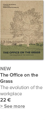
Extract from the article by Javier Mozas 'The Liquid Nature of Workspace', published in THE OFFICE ON THE GRASS
October 17, 2017

Gehry Partners. Facebook Headquarters MPK 20. Menlo Park, Ca., 2015 Photo: a+t research group
Facebook Headquarters MPK 20. Source of inspiration: Shopping malls (United States, 1956-)
“Artistically, the use of conventional elements in ordinary architecture -be they dumb door knobs or the familiar forms of existing construction systemsevokes associations from past experience. Such elements may
be carefully chosen or thoughtfully adapted from existing vocabularies or
standard catalogues rather than uniquely created via original data and artistic intuition.”1
1. Robert Venturi, Denise Scott Brown. “Ugly and Ordinary. Architecture or the Decorated Shed. Theory of ugly and ordinary and related and contrary concepts”. Forum. December, 1971. p. 48.
If we identify the architecture of the US shopping malls as the familiar forms referred to by Venturi and Scott Brown, we are given an insight into the origins of MPK 20, the new Facebook campus in Menlo Park.
The environmental agenda does the rest and in an act of atonement conceals the parking bays which are visible in other shopping centres. The Albany Walmart Supercenter is the ugly duckling of all the bigbox stores, MPK 20 the swan.

The floor plan of the Menlo Park Facebook building differs little from that of a Walmart store. The slight distortion in the orthogonal shape of the smallest boxes forming the whole is the only non-standard feature tolerated by Gehry in the design of the form. The storage spaces for private vehicles are also transformed and, rather than being left exposed, are hidden from sight below the building, as if they were a source of embarrassment.
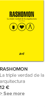
Read the complete article in the book THE OFFICE ON THE GRASS:













 I've read and agree to


